
Export and handoff
Export files, hand a design to the people building it in Dev Mode or as a React project, import from other apps, and work on it together.
Keys on this page are shown for your computer, with the other platform's keys after them.
Export
Any layer or frame keeps its own export settings, saved with the board. Select it and click + in the inspector's Export section to add a row: its size (a scale from 0.5x to 4x, or a fixed width such as 512w or height such as 512h), a suffix added to the file name (for example @2x) and the format (PNG, JPG, WebP, SVG or PDF). An SVG row's settings choose Outline text (text becomes shapes) and Include "id" attribute (each layer gets an id from its name). Add as many rows as you need; − removes one. Ctrl+Shift+E on Windows (⇧⌘E on Mac) jumps to Export.
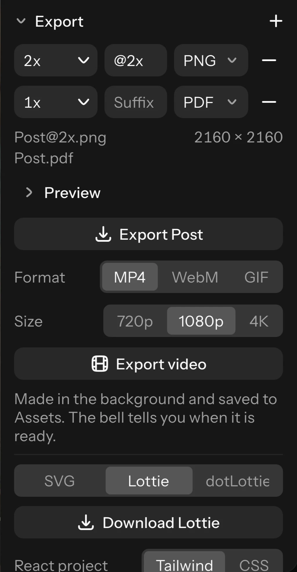
Export makes every file of every selected layer at once, named after the layer and its suffix: one file downloads by itself, several come as one zip (a layer named with slashes, such as icons/arrow, goes in folders). Files are also kept in the project's Assets. Preview shows the first row's picture.
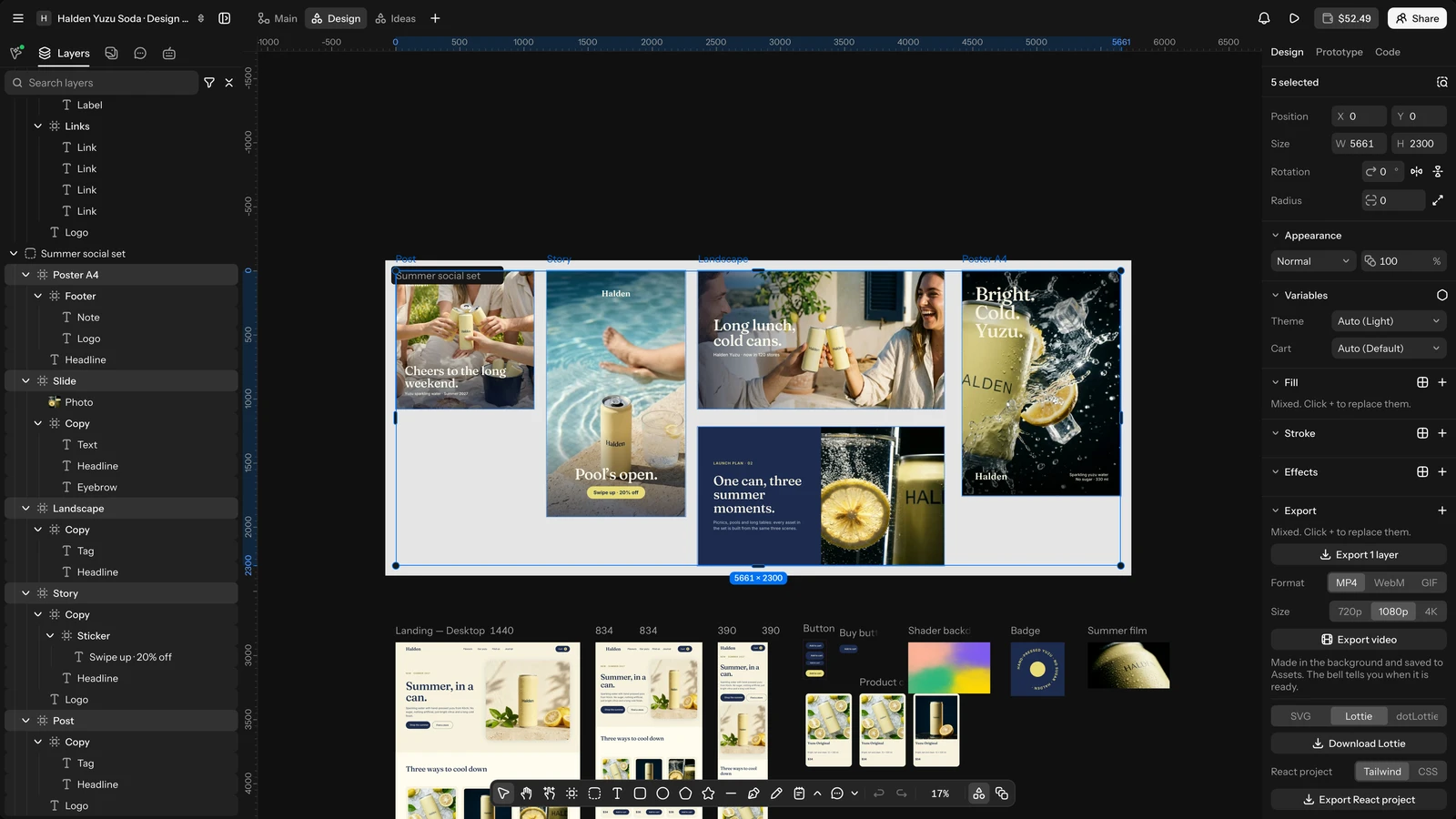
With nothing selected, the inspector exports every frame of the board at once: PNG, JPG, SVG or PDF at 1x, 2x or 3x, several frames as one PDF with a page each.
Copy as PNG (Ctrl+Shift+C on Windows (⇧⌘C on Mac)), Copy as SVG and Copy as code are under Copy/Paste as in the right-click menu. Copy as code copies what the Code tab's Copy all code does, in your code settings (format, layers inside or alone, px or rem, colours). Downloading files and copying pictures are part of the paid plans.
Animated frames also export as video, GIF, Lottie or animated SVG (see Export motion), and frames as a React project (see Export as a React project).
Export as a React project
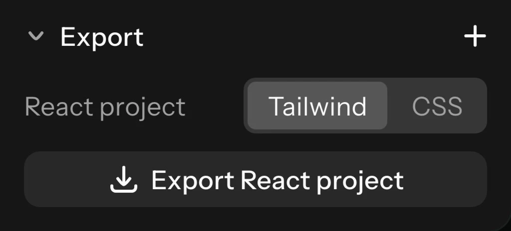
Turn frames into a React project you can run and build on. In the inspector's Export section (with frames selected, or nothing selected for every frame), pick Tailwind or CSS under React project and click Export React project. It is also Export as React project in Actions.
You get a zip with a Vite, React and TypeScript project: a component per frame, your variables and styles as CSS custom properties (modes under data attributes), the pictures, and a README with how to run it (Node 20 or later). A page with breakpoints is one component with media queries. Raelume's fonts are linked from Google Fonts; uploaded fonts are included only when they are marked for web use, and fonts on your computer are named without a file. What couldn't be written is listed in the README. Motion is not included. Downloading the project is part of the paid plans.
Dev Mode
The Code tab (Shift+D on Windows (⇧D on Mac)) is for the people building the design. Everyone who can open the board sees it, viewers too: they read everything, copy the code and download the assets.
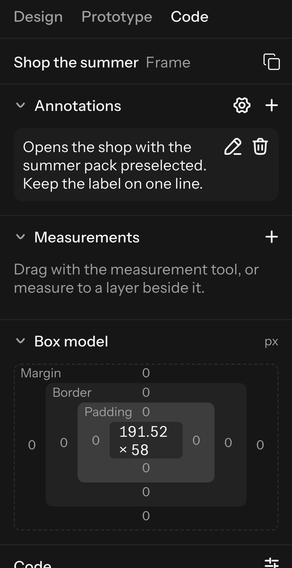
- Box model: the selected layer's size, padding, border and margin as its code writes them, with an auto layout's gaps.
- Code: the selection as CSS, Tailwind or React, in colour. Code settings choose the layers inside or the layer alone, px or rem (with a root size), hex or RGB colours, and, for a page with breakpoints, mobile first or desktop first; they are kept for you. Bulleted and numbered text is written as lists, text on a path as SVG along the same path, and what code cannot do of a layer is listed under Not in the code. A layer that animates gets its motion as CSS keyframes (motion.dev for React) and as JSON. Each block has its own Copy, and Copy all code copies everything, motion too. A copy pastes into a code editor in the format you picked, and onto a Design board as layers again. The variables the code uses are listed by name and open the Variables dialog.
- Assets: the pictures and videos the selection shows, to download (downloads are part of the paid plans).
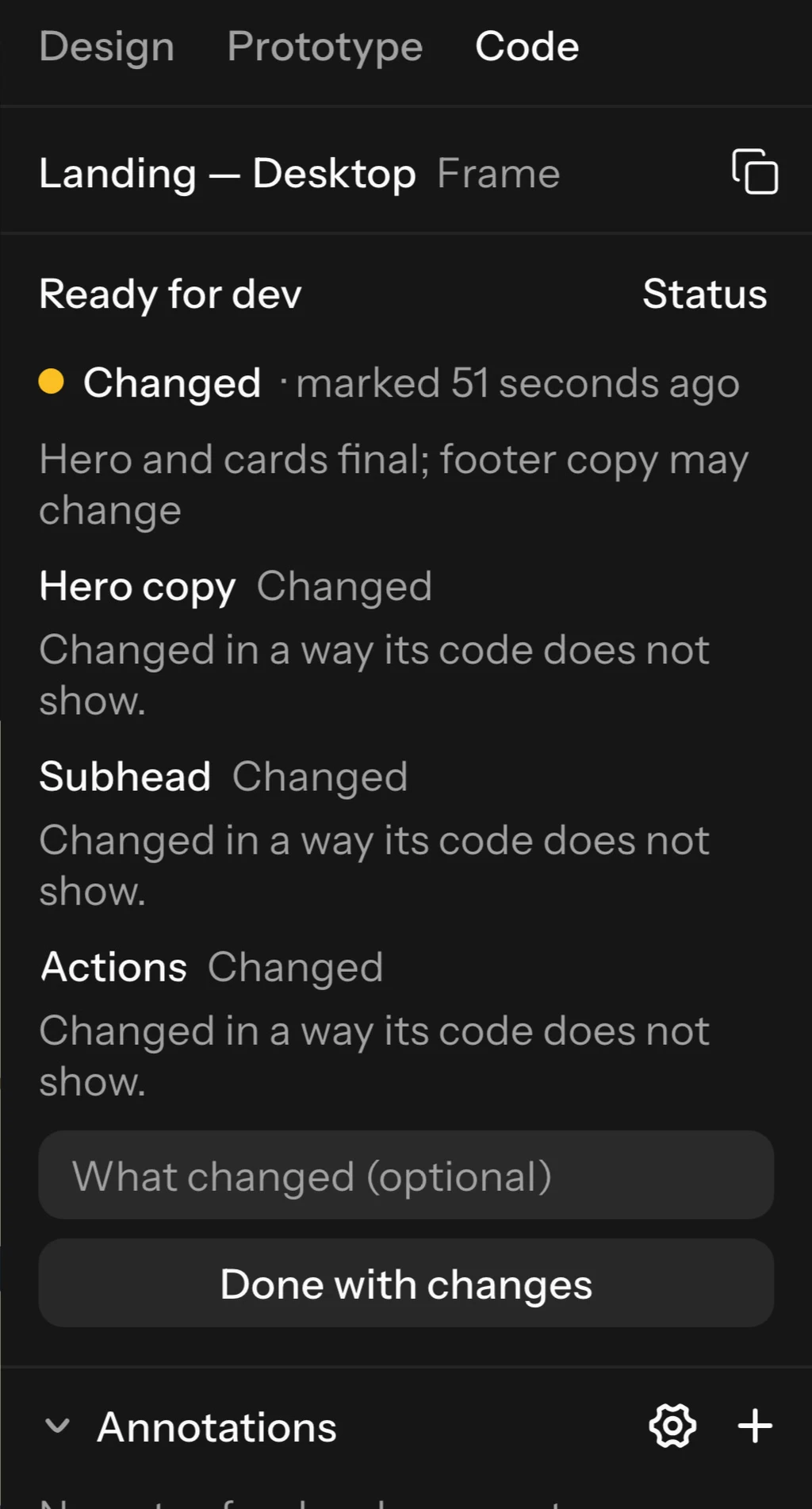
- Ready for dev: select a frame or a section and click Mark ready for dev (above its corner, in the Code tab or from its right-click menu), or Mark completed. When someone edits it afterwards it shows as Changed, and the Code tab lists what changed, layer by layer, with each CSS property before and after. Done with changes marks it again, with a note if you like. Moving the frame on the board, notes, measurements and new values of its variables are not changes. With nothing selected, the Code tab lists everything that is marked.
- Annotations: press Y on Windows (Y on Mac) and click a layer to write a note for developers. Add properties from the layer's own code (width, padding, background-color…); their values stay live as the design changes. Each note can have a category; edit the board's categories from the Annotations section.
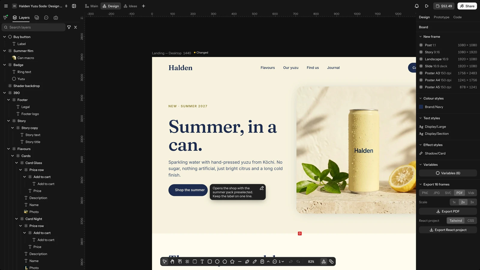
- Measurements: press Shift+M on Windows (⇧M on Mac) and drag from an edge of a layer to an edge of another (or across one layer) to pin the distance. Drag its label to move the line; give it words in the Code tab.
- Show or hide annotations and measurements from the zoom menu (Annotations). They are for the project's people: visitors of a public project never see them.
Import files and paste HTML
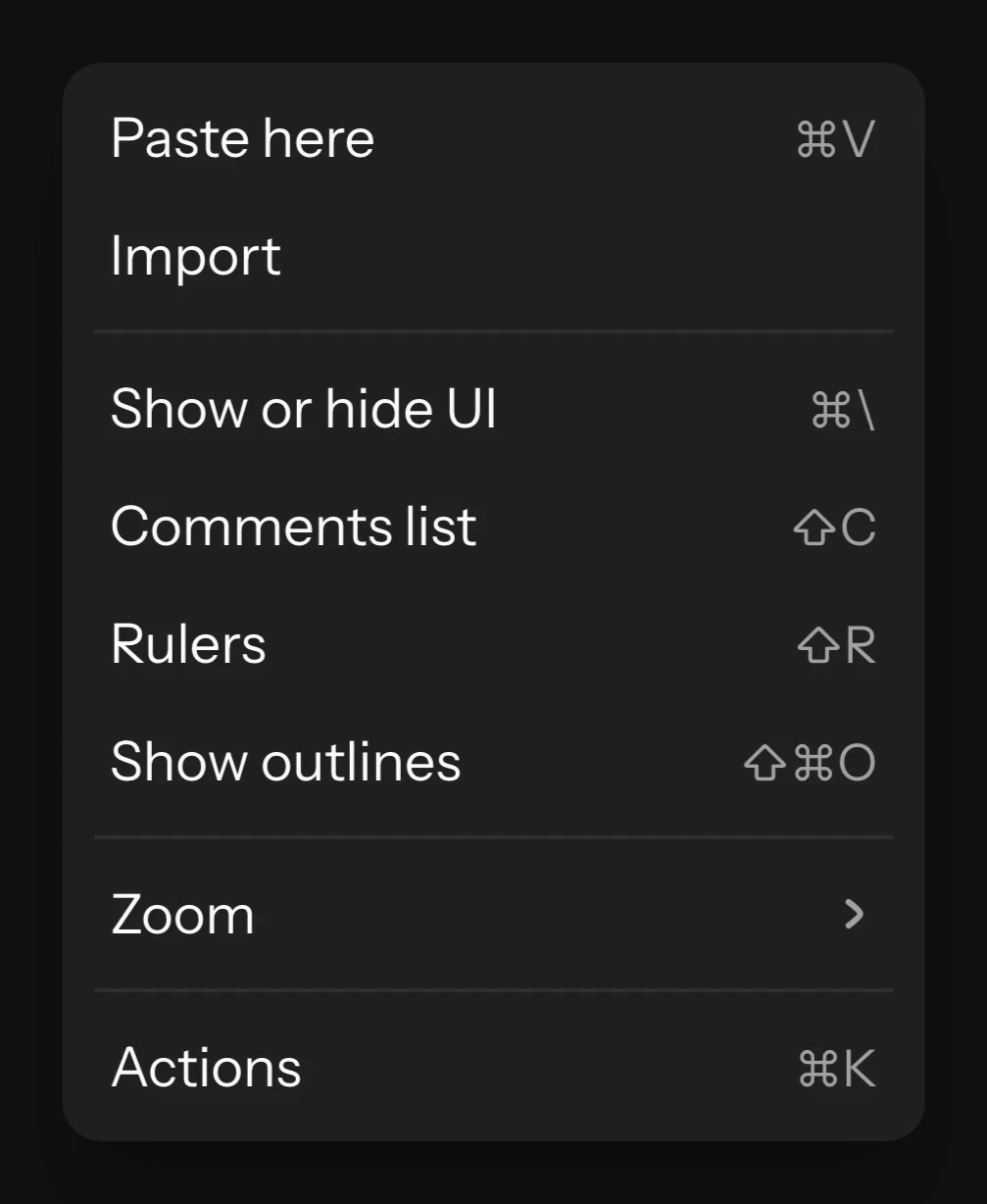
Drop, paste or import SVG, PDF and Sketch files to bring designs from other apps over as editable layers: right-click the empty board and choose Import. See Moving from Figma or Sketch.
Paste HTML and CSS: copy part of a web page, or code from the Code tab, and paste it on the board. It comes over as layers: flex layouts become auto layout, grids become grids, and text, backgrounds, borders and shadows come over. Scripts, embedded content, links, web fonts and linked pictures are left out (pictures become empty picture slots), and a notice lists what was left out. One paste brings up to 10 MB and 20,000 elements.
Comments
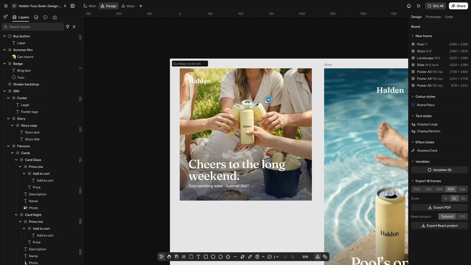
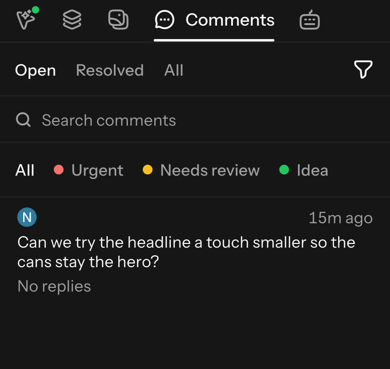
Press C on Windows (C on Mac) and click to pin a comment on a layer or frame; the pin follows it. Shift+C on Windows (⇧C on Mac) opens the list of comments. See Comments.
Working together
Everyone in the project sees edits and cursors live. Viewers see the board but cannot edit; they can still comment. A Design tab in a public project is visible to visitors. See Collaboration.