
Components and variables
Design a layer once and reuse it: components, variants, slots, and variables with modes such as light and dark.
Keys on this page are shown for your computer, with the other platform's keys after them.
Components
A component is a layer you design once and use many times: every copy, an instance, follows the main component when it changes. Select layers and press Ctrl+Alt+K on Windows (⌥⌘K on Mac) (or Create component in the inspector). One selected frame becomes the main component; other selections are wrapped in a new frame first.
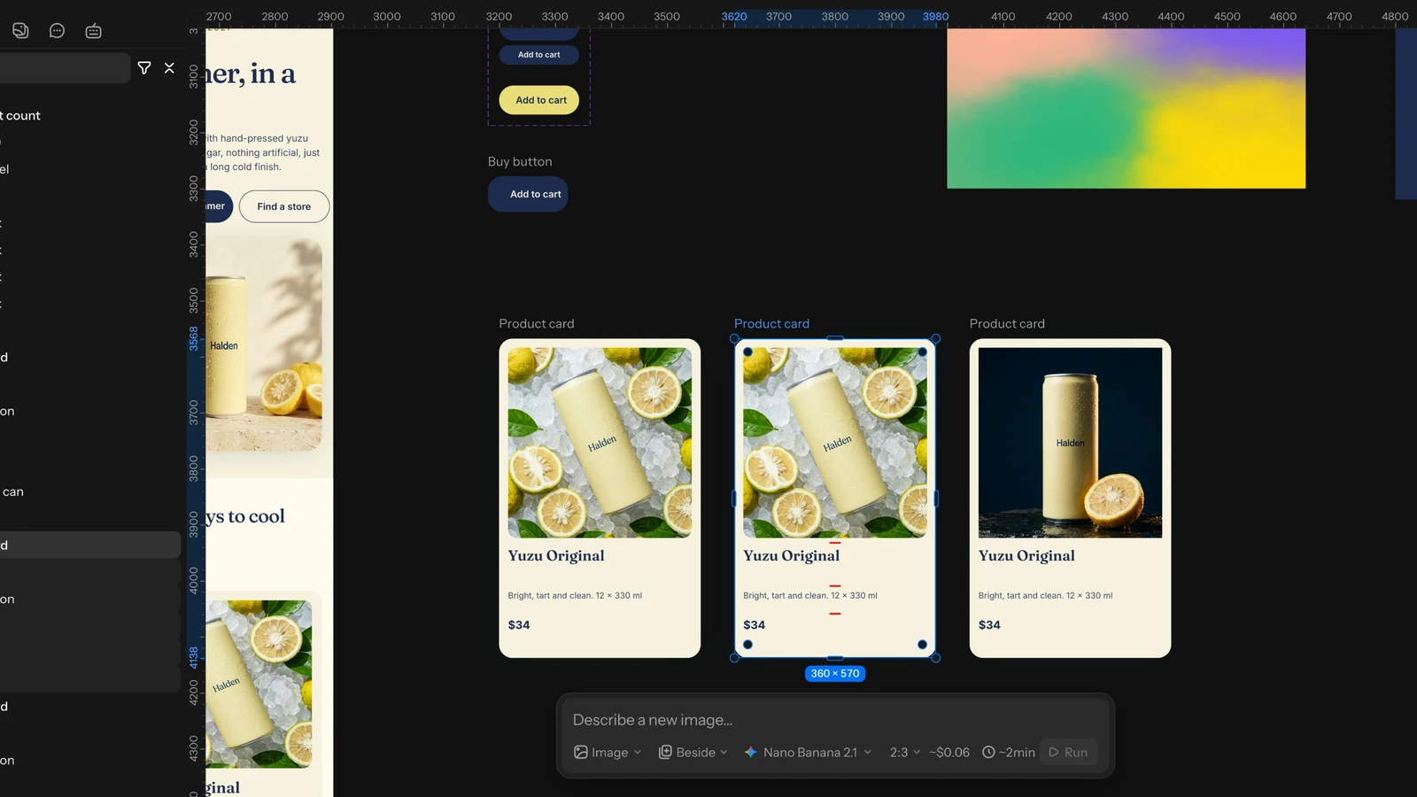
- Create instance from the main component's inspector, or drag the component from Assets (its Components list) onto the board. Click a component there to place it in the middle of the view.
- Overrides: change text, colours or anything else in an instance, and the change stays on that instance. Reset overrides in the Instance section undoes them, for the whole instance or for one layer inside it.
- Swap component: pick another component in the instance's Swap row, or hold ⌥ (Alt on Windows) while you drop a component on an instance. Overrides stay where the layers match.
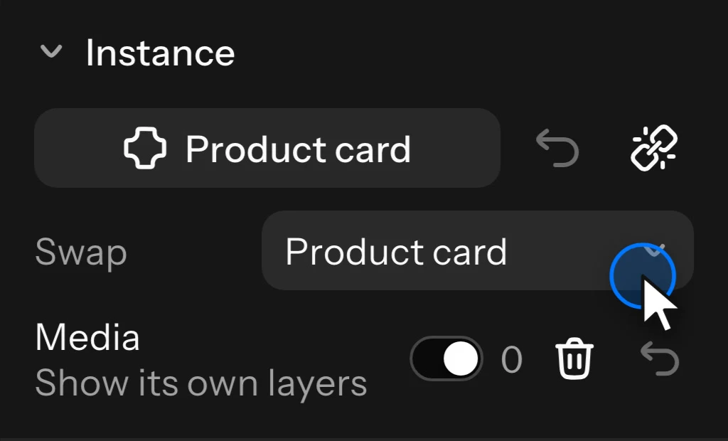
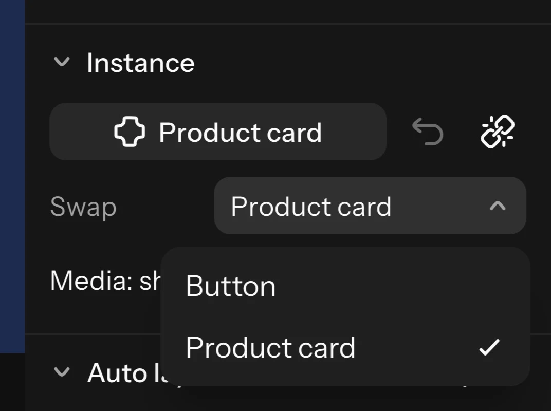
- Detach instance (Ctrl+Alt+B on Windows (⌥⌘B on Mac)) makes the instance a plain frame; instances nested in it stay instances.
An instance can be resized: its layers follow their constraints. Components belong to their board: copying or duplicating a main component makes a plain frame, not a second main component.
Variants and component properties
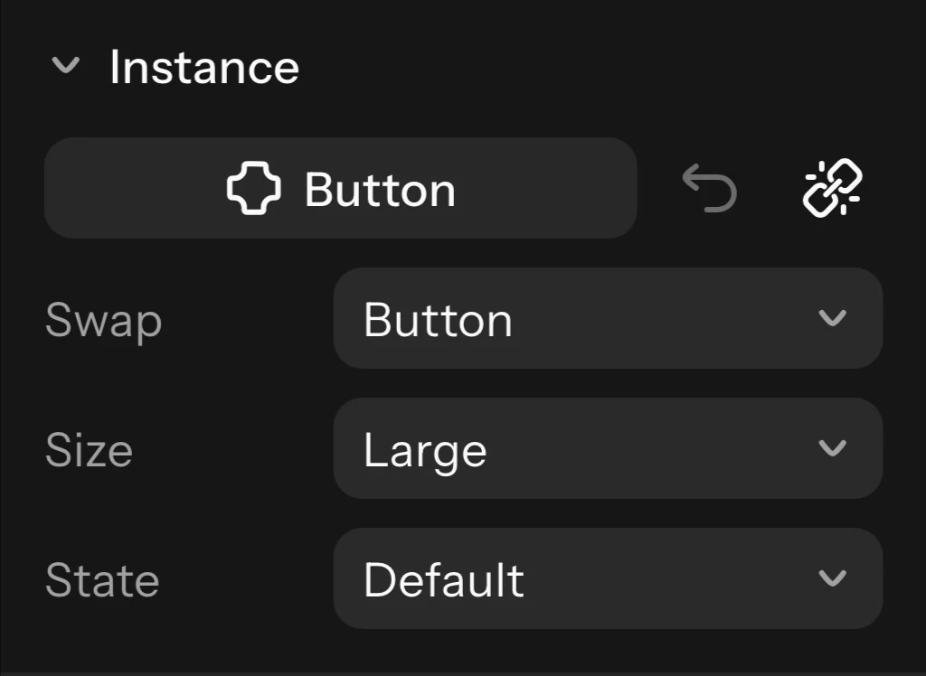
Variants are versions of one component, such as a button's sizes and states, kept together in a component set. Select several main components and choose Combine as variants, or Add variant on a component set or a variant.
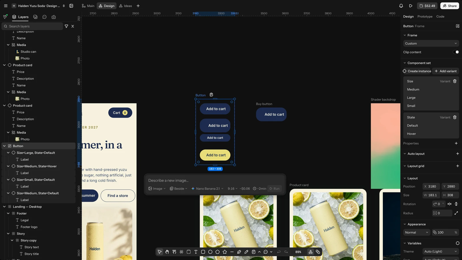
Name each variant as properties and values, such as Size=Large, State=Hover, or set the values in its Variant section. Each property becomes a menu on the instance, so you switch an instance between variants there; the top-left variant is the default. The inspector warns when a variant is not named this way, or when two have the same values. Give a variant an interaction that changes to another variant to make an interactive component (see Prototype and Present).
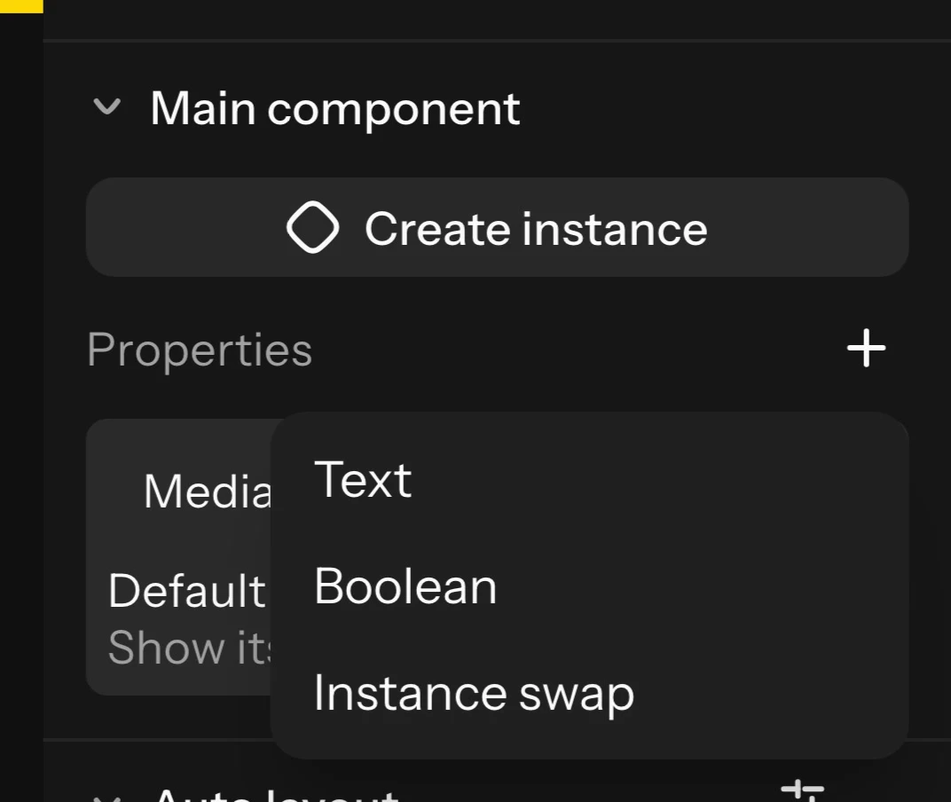
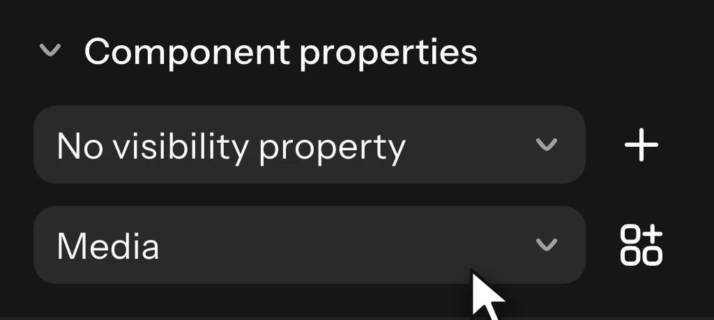
Component properties let an instance change parts of a component without overrides. On a main component, click + (Add property) and pick a kind, then bind a layer inside to it under Component properties:
- Text: the text a text layer shows.
- Boolean: whether a layer is visible.
- Instance swap: which component a nested instance shows.
- Variant (on a component set): a variant property.
Each instance shows its properties' values in its Instance section.
Slots
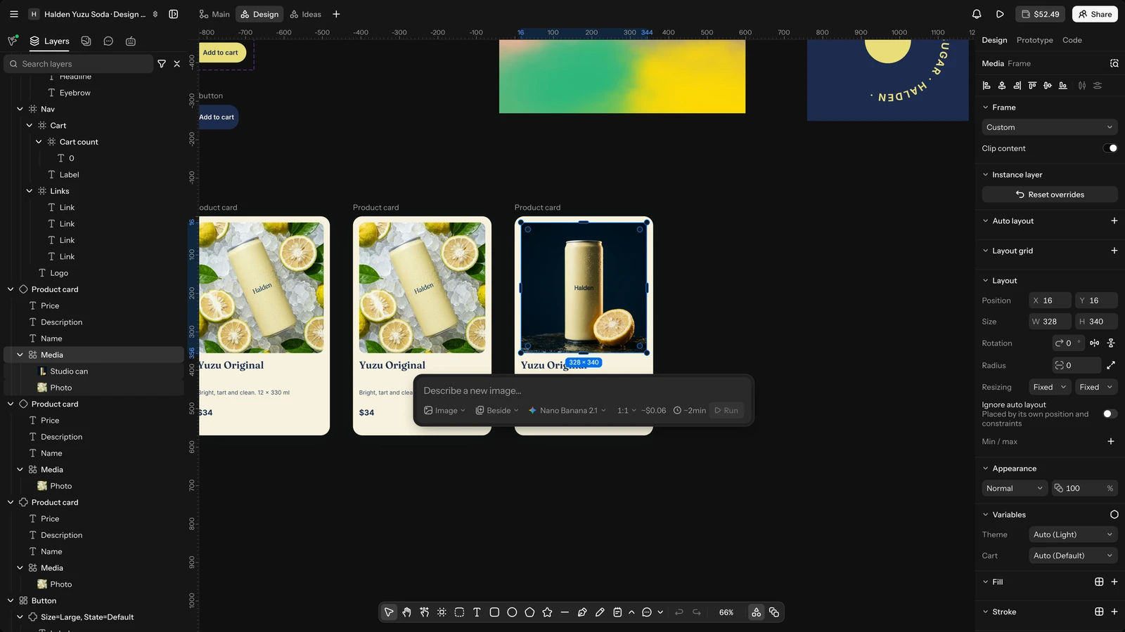
A slot is a frame in a component that each instance fills with its own layers, such as the body of a card or the items of a list. Select a frame inside a main component and choose Convert to slot (Ctrl+Shift+S on Windows (⇧⌘S on Mac)).
In an instance, draw, drop or paste layers into the slot: they belong to that instance. The slot's switch shows or hides the component's own layers in it. Delete contents empties the slot, and Reset gives it back the component's layers. Only an instance's own slots can be filled, not those of instances nested inside it.
Variables and modes
Variables are named values (colours, numbers, text, on or off, timings and easings) you apply to layers, so one change updates every layer that uses them. Modes give each variable a value per theme, brand or size, such as light and dark. Open them with Variables in the board's inspector (nothing selected), or Open variables in a layer's Apply variable menu.
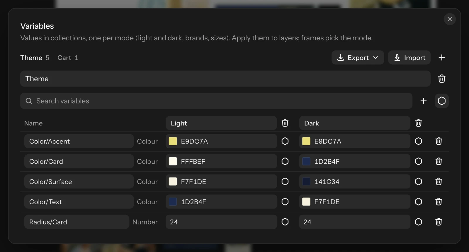
- Create collection, then Create variable and pick its type: Colour, Number, String, Boolean, Timing or Easing. A slash in a name (color/brand) puts variables in groups.
- Add mode adds a column: each variable gets a value per mode. The first mode is the default.
- Use another variable in a cell makes it stand for another variable of the same type (an alias).
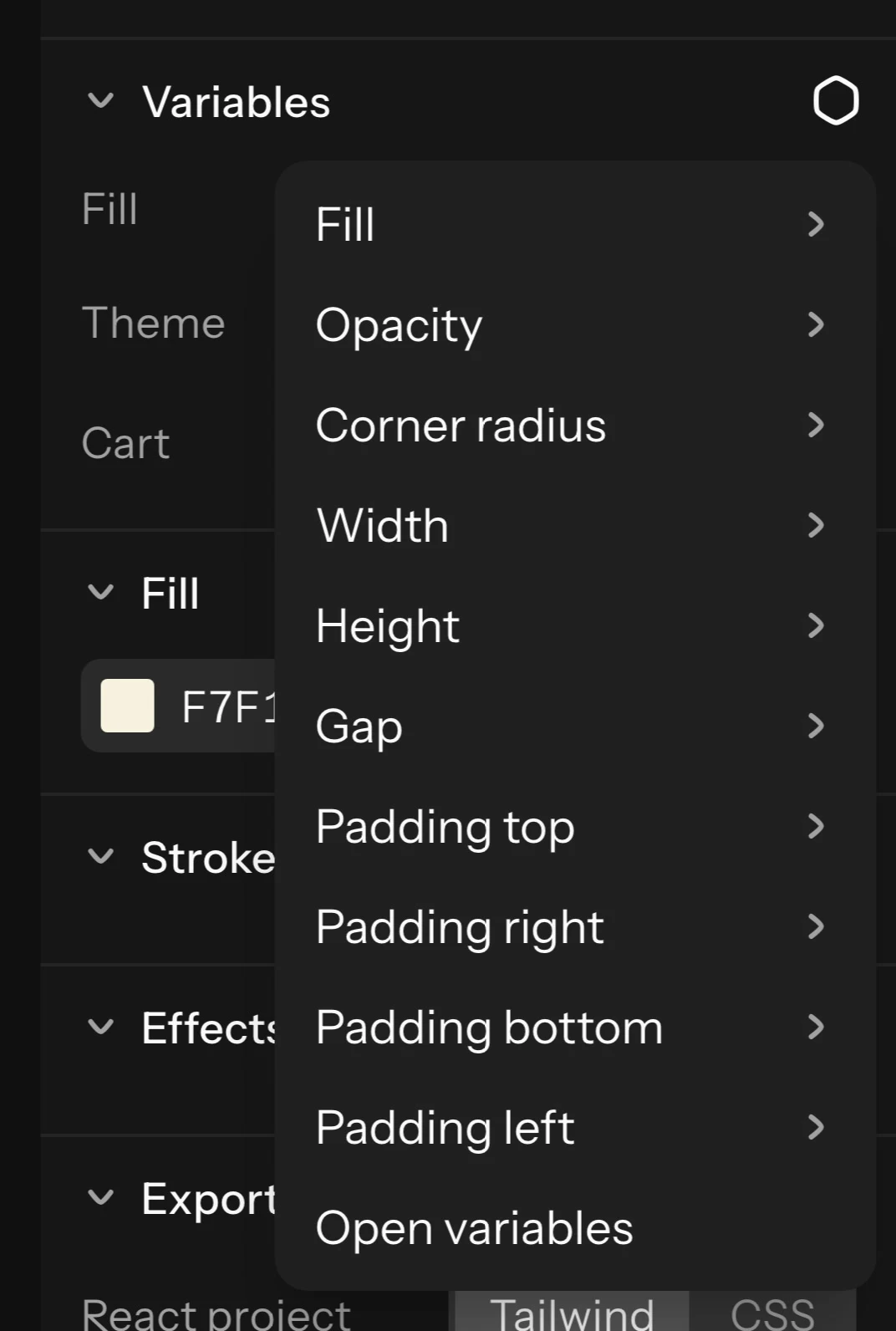
- Apply a variable: select a layer, click Apply variable in its Variables section, pick the property (fill, stroke, text colour, opacity, corner radius, width, height, font size, gap, padding, text, font, visibility and more) and the variable. A text can show a string or a number variable, so a counter set by a prototype shows its count. Detach it from the same section. Editing a bound value by hand detaches it too.
- Pick a mode: select a frame, and under Variables choose the collection's mode. Everything inside uses it, until a frame inside picks another. An instance can pick its own mode, so one component shows light or dark per instance.
Timing variables set a frame's animation length, and Easing variables a keyframe's easing (see Keyframes and easing).
Design tokens: export and import
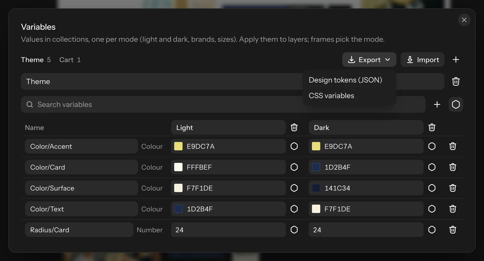
Variables travel to and from code and other design apps as design tokens. In the Variables dialog, click Export and choose:
- Design tokens (JSON): the W3C design tokens format Figma reads, one file per collection and mode (several come as one zip).
- CSS variables: one
variables.css, with each collection's default mode in:rootand other modes under a data attribute.
To import, click Import and pick one or more .tokens.json files, one per mode. Import tokens shows what the files change before anything is written: the collection they go into, new modes, and each variable as new, changed or the same. Files from Raelume name their collection; files from Figma go into the collection you pick. Variables are matched by name, and variables the files don't mention are left alone. Shadows, typography and other token types are left out. Downloading tokens is part of the paid plans.